Saturday, August 11, 2012

J C Leyendecker Rarities - part 1

From my extensive personal collection of J C Leyendecker illustrations I am sharing some of the odd and often rare bits.
Leyendecker interior illustration with Swordplay and Vultures.
A rare self portrait in the mirror of JCL at his easel, painting his models.
A Drawn illustration.  Pencil or Charcoal?
A wonderfully elegant and restrained cigarette ad.

Saturday, August 4, 2012

19th Century Dragons - part 2

Here are a few more Dragon images that may be new to you to show the variations that imagination took in the 19th century artists.

"The Garden of the Hesperides" by Albert Herter.
A Heyden painting.

Don't know the artist of this image.
Thomas Gotch dragon painting.
St George and the Dragon by Briton Riviere.

An odd Dragon by Engel.


St George and the Dragon by Arthur Hoffmann.

Thursday, August 2, 2012

19th Century Dragons

In studying 19th Century Fantasy Art I have noticed, (and made a recurrent theme of these blogs as well as my Facebook album) that many developments of the modern world have severely restricted and narrowed the imagination of more recent fantasy artists.  In the case of dragons I blame paleontology and the discovery of the "Brontosaurus". (Although scientific naming convention says that that name is no longer correct and it should be called an Apatosaurus, to me it will always be a Brontosaurus as mentioned in the 1933 King Kong.)
Two strange beasts by Rudolf Jettmar.
In these examples of Dragon paintings we see a wide variety of body form and details.


Franz Moser Dragon

Sydney Muschamp's "The Enchantress"

Surand Painting.
Another Franz Moser image.

An early painting by Alphonse Mucha.

A Sea Serpent by Elihu Vedder (Sort of a dragon).
A "Post" cover by J C Leyendecker with an odd take on a Dragon.


Monday, July 30, 2012

Alternate Flying Methods

Flying figures are a common feature in Fantasy Art. Usually this takes the form of winged people or simply figures floating magically. So while melding over Fantasy images from my Facebook gallery "Victorian Fantasy Paintings", I thought I would show alternate forms of flying.

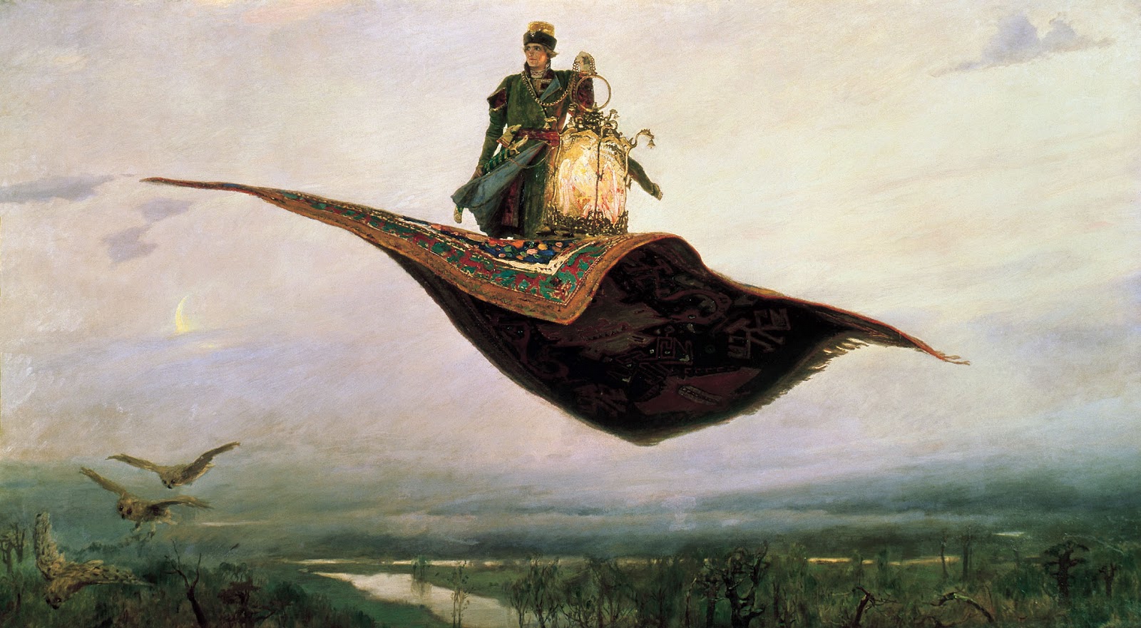
A beautiful Flying carpet painting by Vasnetsov.
Jose Segrelles paints a much more free form flying carpet.
"The Flying Islands of the Night" by American illustrator Franklin Booth.

Norman Rockwell's  illustration for "The Goddess and Private Gallagher".
Edward R Hughes paints a watercolor of an anachronistic Pegasus

Willy Pogany's film advertising art of flying by Genie.
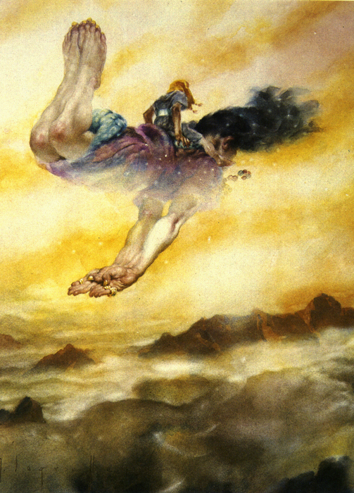
A beautifully sensitive watercolor of riding on a Genie by Segrelles
By Gustave Dore, here is a frog flying on a kite. "Between Sky and Ground".
Frantisek Kupka drawing of a Griffin mount.

Flying on the back of ?  A painting by Maximilian Pirner.
W Heath Robinson watercolor of flying on clouds.

Saturday, July 28, 2012

Imaginative color in 19th Century Fantasy Art - Part 2 Under Water Colors


Last time that I spoke of imaginative color I stated that the invention of the camera and its widespread use for artistic reference as well as the effect of living in a world saturated with photography had severely limited the color imagination of artists.  By deferring to the authority of the camera to capture “Reality”, most post 19th century artists allow themselves to be bound by unnecessary limits on their color imagination.

Reality versus Imagination. An Underwater photo and "La Sirène" by Albert Maignan

The invention of color underwater photography, along with the ease with which people can take up skin diving and can see the real effects of deep water on light and color, has led to the stultifying of the imaginative use of color in underwater paintings.  Because in the real world, light attenuates as you dive deeper and the color range of that light is constricted more and more towards the blue green range many artists, in an attempt to achieve realism, allow their palettes to become constricted as well. Deep sea photographs always look too much like green tinted black and white photos.

"Ophilia" by Steck
Albert Guillaume's "Amour Profond". The color sketch and the finish (B & W photo).

What many forget is that in the “Fantasy World” (a real place with its own system of physical rules) color behaves in a totally unrestrained way in order to heighten the magic of the environment. 19th century artists were free to exercise their imagination because “Science” had not intruded to hold them back.

Auguste Leveque obviously allows no constraint on his imagination.
Charles Courtney Curran "A Deep Sea Fantasy".  


Although Curran does skew the colors in the direction of the blues, he still maintains some of the non blue tones to keep the painting from seeming monochrome.

Ilya Repin's "Sadko In The Underwater Kingdom".
This is one of my paintings circa 2010. "Coronation" by Richard Hescox


Monday, July 23, 2012

What I'm Up To

I am currently working away on some of the 60+ black and white illustrations I need to create for the Subterranean Press edition of George R R Martin's "A Clash Of Kings". Not only do I have to pick interesting images from the book to draw up, but I have to make sure that they are evenly spread throughout the volume.

This is a working sketch for a pen drawing.
 Additionally I feel an internal pressure to try to show images of people and occurrences that are important to the story, although there are many vague references to less important details that suggest very interesting drawings!  In looking at great illustrated books by Golden Age illustrator I am struck by their choices of subjects to depict. Not always the most dramatic scene as we were taught to pick when doing paperback book covers. My favorite quote from N C Wyeth addresses this.  Andrew Wyeth quoting his father: 


" I never paint a subject, an illustration from a story that’s described by the author. I take something he hasn't described, but maybe hinted at, and so I enrich the book."

A sketch for an illustration of Samwell.

The Direwolf "Ghost"
Where my final drawings will end up?  Who knows?


Saturday, July 21, 2012

Sketches and Finished Art

I love comparing sketches to finished work. Aside from being able to gain insights into the working procedures of various artists, the more important reason is to see their thought process in pushing the picture forward. To see what they learned from doing the sketch, and needed to correct in the final painting. This could be a repositioned arm or a major change to the pose.  An adjustment of the value composition or adding completely new elements.

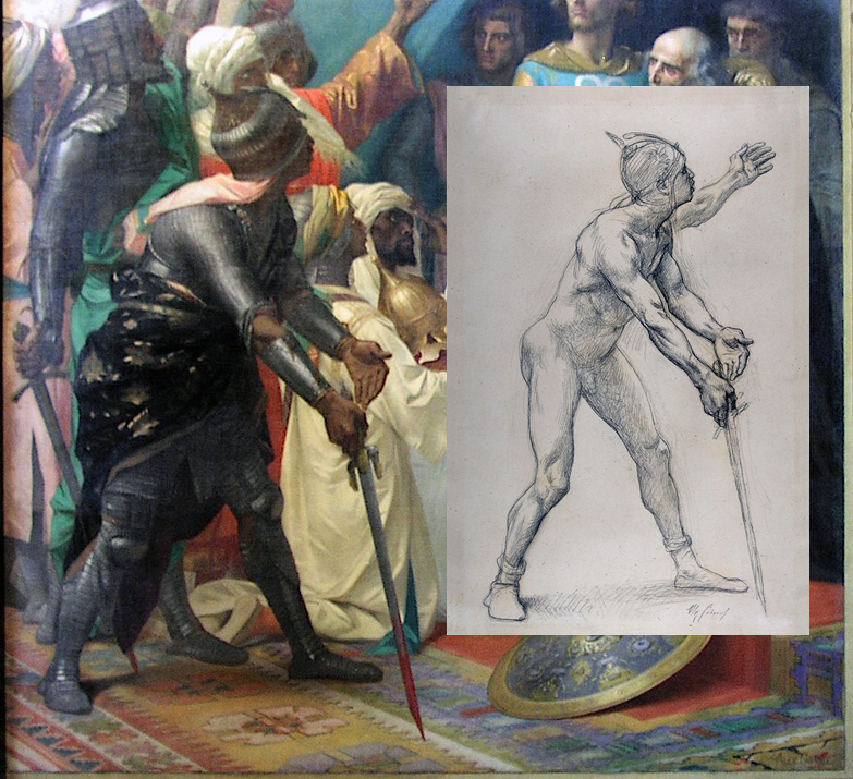
A Detail of a Mural by Alexander Cabanel
 When you see a difference between the sketch and finish you should try to reconstruct the artist thoughts and reasons for the change.  Always assume he had a good reason.

Campaspe by John William Godward

Of course, unless an artist is extraordinarily lucky (or skillful) there will be changes necessary between the sketch and finish. The sketch is a tool to identify what is right and what is wrong in the pre-conception of the image that the artist holds in his minds eye.


The primary difference between these Bouguereau images (below) is the development of the darker values. The darkening behind the legs at the bottom helps the "rise" of the figures. However this darkening required Bouguereau to redesign the silhouette of the white drapery to flow behind the mans foot to make it read easier and disengage it from the background thereby adding to the feeling of floating. Additionally it creates an alignment of leg, foot and cloth edge that echos and reinforces the lines of the woman's legs pointing diagonally down to the lower corner and again emphasizes the thrust upward.

A Bouguereau Finish and sketch painting.
A sketch drawing for Herbert Draper's "Flying Fish"
Another Bouguereau sketch.