Monday, July 30, 2012

Alternate Flying Methods

Flying figures are a common feature in Fantasy Art. Usually this takes the form of winged people or simply figures floating magically. So while melding over Fantasy images from my Facebook gallery "Victorian Fantasy Paintings", I thought I would show alternate forms of flying.

A beautiful Flying carpet painting by Vasnetsov.
Jose Segrelles paints a much more free form flying carpet.
"The Flying Islands of the Night" by American illustrator Franklin Booth.

Norman Rockwell's  illustration for "The Goddess and Private Gallagher".
Edward R Hughes paints a watercolor of an anachronistic Pegasus

Willy Pogany's film advertising art of flying by Genie.
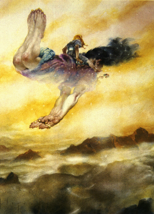
A beautifully sensitive watercolor of riding on a Genie by Segrelles
By Gustave Dore, here is a frog flying on a kite. "Between Sky and Ground".
Frantisek Kupka drawing of a Griffin mount.

Flying on the back of ?  A painting by Maximilian Pirner.
W Heath Robinson watercolor of flying on clouds.

Saturday, July 28, 2012

Imaginative color in 19th Century Fantasy Art - Part 2 Under Water Colors


Last time that I spoke of imaginative color I stated that the invention of the camera and its widespread use for artistic reference as well as the effect of living in a world saturated with photography had severely limited the color imagination of artists.  By deferring to the authority of the camera to capture “Reality”, most post 19th century artists allow themselves to be bound by unnecessary limits on their color imagination.

Reality versus Imagination. An Underwater photo and "La Sirène" by Albert Maignan

The invention of color underwater photography, along with the ease with which people can take up skin diving and can see the real effects of deep water on light and color, has led to the stultifying of the imaginative use of color in underwater paintings.  Because in the real world, light attenuates as you dive deeper and the color range of that light is constricted more and more towards the blue green range many artists, in an attempt to achieve realism, allow their palettes to become constricted as well. Deep sea photographs always look too much like green tinted black and white photos.

"Ophilia" by Steck
Albert Guillaume's "Amour Profond". The color sketch and the finish (B & W photo).

What many forget is that in the “Fantasy World” (a real place with its own system of physical rules) color behaves in a totally unrestrained way in order to heighten the magic of the environment. 19th century artists were free to exercise their imagination because “Science” had not intruded to hold them back.

Auguste Leveque obviously allows no constraint on his imagination.
Charles Courtney Curran "A Deep Sea Fantasy".  


Although Curran does skew the colors in the direction of the blues, he still maintains some of the non blue tones to keep the painting from seeming monochrome.

Ilya Repin's "Sadko In The Underwater Kingdom".
This is one of my paintings circa 2010. "Coronation" by Richard Hescox


Monday, July 23, 2012

What I'm Up To

I am currently working away on some of the 60+ black and white illustrations I need to create for the Subterranean Press edition of George R R Martin's "A Clash Of Kings". Not only do I have to pick interesting images from the book to draw up, but I have to make sure that they are evenly spread throughout the volume.

This is a working sketch for a pen drawing.
 Additionally I feel an internal pressure to try to show images of people and occurrences that are important to the story, although there are many vague references to less important details that suggest very interesting drawings!  In looking at great illustrated books by Golden Age illustrator I am struck by their choices of subjects to depict. Not always the most dramatic scene as we were taught to pick when doing paperback book covers. My favorite quote from N C Wyeth addresses this.  Andrew Wyeth quoting his father: 


" I never paint a subject, an illustration from a story that’s described by the author. I take something he hasn't described, but maybe hinted at, and so I enrich the book."

A sketch for an illustration of Samwell.

The Direwolf "Ghost"
Where my final drawings will end up?  Who knows?


Saturday, July 21, 2012

Sketches and Finished Art

I love comparing sketches to finished work. Aside from being able to gain insights into the working procedures of various artists, the more important reason is to see their thought process in pushing the picture forward. To see what they learned from doing the sketch, and needed to correct in the final painting. This could be a repositioned arm or a major change to the pose.  An adjustment of the value composition or adding completely new elements.

A Detail of a Mural by Alexander Cabanel
 When you see a difference between the sketch and finish you should try to reconstruct the artist thoughts and reasons for the change.  Always assume he had a good reason.

Campaspe by John William Godward

Of course, unless an artist is extraordinarily lucky (or skillful) there will be changes necessary between the sketch and finish. The sketch is a tool to identify what is right and what is wrong in the pre-conception of the image that the artist holds in his minds eye.


The primary difference between these Bouguereau images (below) is the development of the darker values. The darkening behind the legs at the bottom helps the "rise" of the figures. However this darkening required Bouguereau to redesign the silhouette of the white drapery to flow behind the mans foot to make it read easier and disengage it from the background thereby adding to the feeling of floating. Additionally it creates an alignment of leg, foot and cloth edge that echos and reinforces the lines of the woman's legs pointing diagonally down to the lower corner and again emphasizes the thrust upward.

A Bouguereau Finish and sketch painting.
A sketch drawing for Herbert Draper's "Flying Fish"
Another Bouguereau sketch.

Wednesday, July 18, 2012

Imaginative color in 19th century fantasy art - Part 1


Here are a few of the images previously posted in my “Victorian Fantasy Art” album on Facebook, but with new comments:
This is a painting by Benes Knupfer who has pushed the colors in a lyrical direction.
Before color photography began limiting the imagination of artist by “dumbing down” the color range that they were used to seeing (remember that the photographic process compresses the millions of color shades of nature into a mechanically limited few thousand) fantasy artists felt free to stretch the colors in their paintings in lyrical and dramatic directions, though always taking care to maintain a naturalistic proportional relationship among the colors.

A mysterious beauty of a painting by Maximilian Pirner who has made some unexpected color choices
This made sure that even as the colors were exaggerated the image still gave the impression of being a believably real representation. When these proportional relationships between colors and values are lost the image begins to look cartoony and the main goal of good fantasy art: “To make the unreal seem real” is lost as well.

"Pharaoh's Army Engulfed By The Red Sea" by Frederick Arthur Bridgman.
Gaston Bussiere's painting of "The Rhine Maidens"

Another Bussiere painting of sirens.  He always paints with highly saturated colors.

Tuesday, July 17, 2012

19th Century Fantasy Art


This is a continuation and expansion of the “Victorian Fantasy Painting” album that I have been posting on Facebook.  Along with new posts here, I plan to meld over the images and insights from that gallery so that all the images can be found and appreciated in one location.

My primary goal in creating these posts is to re-introduce many forgotten fantasy paintings and artists to modern day followers of that genre, whether practicing artists themselves or fans of fantasy art.  The great defect with most art history books is that they continually reprint the same “Important” paintings over and over again while ignoring the wider world of the entire movement.  As a result, most contemporary artists have a very limited view of the thought processes practiced back then in the act of creativity.  The world of fantasy art today is bound by unnecessary habits and restrictions that leave the genre all the poorer.

"The Cloud" by Arthur Hacker
The nude form has long been a staple of almost all art.  In fantasy art it has a rich place because of the various conceptual uses it can be applied to.  My favorite is “Allegory” in which the human form is used to symbolize an abstract concept or condition, or an aspect of nature.  Arthur Hacker uses it beautifully in “The Cloud”.  The human form enhances the connection of the viewer and therefore the emotional communication.

Hermann Behrens depicts a woman whose vanity (the mirror symbol) is associated with Death.
 Another use of the nude is to serve as an anchor for a philosophical statement about such concepts as the danger of the female of the species.  Symbolist art of this period is rife with allusions to death and decadence in relation to the “Femme Fatale”

"Lilith" by John Collier
Finally the nude was popular in depicting specific characters from mythology.  In fact this genre was popular because it provided an excuse (for those who needed one) to paint a beautiful nude.


Thursday, July 12, 2012

Using Costumes

Over the years I have made extensive use of costumes in my illustration work.  The better the costume, the more help it is in creating a good illustration.  Sometimes I have raided the thrift stores and resorted to re cutting and resewing my own creations.  But while I lived near Hollywood and did work for film advertising, I was able to make use of a great resource: Western Costume.  That warehouse contained many thousands of beautiful costumes created for and rented to motion picture production companies.

In a single large room dedicated solely to medieval male tunics I would paw through hundreds on triple story racks to find just the one I wanted for a book cover. Not cheap to rent, but worth it.

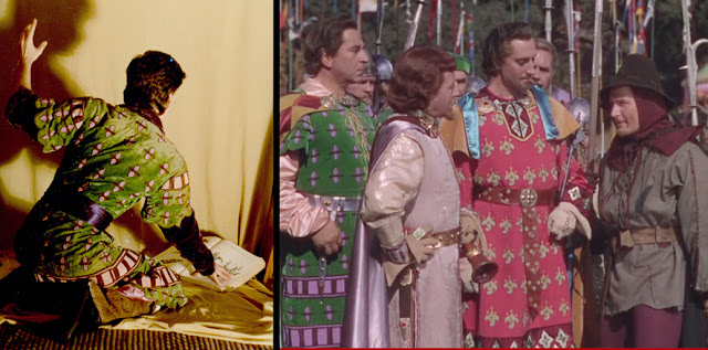
Below is a picture of one I chose which is being worn by "Rocketeer" artist and pal Dave Stevens for a book cover illustration.
The same tunic in the 1980's and 40 years earlier.

Some years later while watching Errol Flynn's "The Adventures of Robin Hood" I realized that from the myriad of tunics I had picked one from that film.  They kept them in good repair through the decades.

Tuesday, July 10, 2012

What I'm up to


For my first post I thought I would tell you about my current project.
I am working with George R R Martin and Subterranean Press on the massively illustrated, limited edition of “A Clash of Kings” book two of George’s “A Song of Ice and Fire” series. This will contain (when I finish!!) around 70 black and white illustrations of various sizes and formats and 6 full color images including two wrap around covers.
Here is a shot of the first cover painting in progress.
And the second cover painting.

Working with George (when I can tear time away from his hectic schedule) is stimulating and challenging. Like any proud father he is very protective of his creations and especially their appearance. Some of my sketches have hit the mark right away while others have needed numerous sketches to work out.
A drawing of Catelyn that George liked right off.

George is quite forthcoming with information from his fertile brain about what things should look like, and this sometimes includes details that he has thought of, but never actually written down in his books. (More on that in a future post). That is what makes the work so fascinating. I get the chance to learn things that others don’t know yet, until I illustrate them or George writes them down.

As the project develops check in here for more comments and images of the work in progress.