Showing posts with label Sirens. Show all posts

Sunday, August 19, 2012

Sketches and Finished Art - Part 2


As mentioned in an earlier blog, there is much to learn by studying sketches alongside the finished work.  The decisions of the artist in refining their concepts become visible and this should lead us to better and/or different thinking as we create our own works.

A sketch by Jose Segrelles for his painting "The Rhinegold".

Detail of "The Rhinegold".  Note the figure changes of the Rhine Maidens.


Herbert Draper's "The Gates of Dawn".

Otto Greiner studies for "Ulysses and the Sirens".   (Below)


John Singer Sargent's "Lady Macbeth"
Various ideas for "The Mermaid" by Andrew Loomis
The finish by Loomis
"Perseus and Andromeda" by Lord Leighton.

Saturday, July 28, 2012

Imaginative color in 19th Century Fantasy Art - Part 2 Under Water Colors


Last time that I spoke of imaginative color I stated that the invention of the camera and its widespread use for artistic reference as well as the effect of living in a world saturated with photography had severely limited the color imagination of artists.  By deferring to the authority of the camera to capture “Reality”, most post 19th century artists allow themselves to be bound by unnecessary limits on their color imagination.

Reality versus Imagination. An Underwater photo and "La Sirène" by Albert Maignan

The invention of color underwater photography, along with the ease with which people can take up skin diving and can see the real effects of deep water on light and color, has led to the stultifying of the imaginative use of color in underwater paintings.  Because in the real world, light attenuates as you dive deeper and the color range of that light is constricted more and more towards the blue green range many artists, in an attempt to achieve realism, allow their palettes to become constricted as well. Deep sea photographs always look too much like green tinted black and white photos.

"Ophilia" by Steck
Albert Guillaume's "Amour Profond". The color sketch and the finish (B & W photo).

What many forget is that in the “Fantasy World” (a real place with its own system of physical rules) color behaves in a totally unrestrained way in order to heighten the magic of the environment. 19th century artists were free to exercise their imagination because “Science” had not intruded to hold them back.

Auguste Leveque obviously allows no constraint on his imagination.
Charles Courtney Curran "A Deep Sea Fantasy".  


Although Curran does skew the colors in the direction of the blues, he still maintains some of the non blue tones to keep the painting from seeming monochrome.

Ilya Repin's "Sadko In The Underwater Kingdom".
This is one of my paintings circa 2010. "Coronation" by Richard Hescox


Saturday, July 21, 2012

Sketches and Finished Art

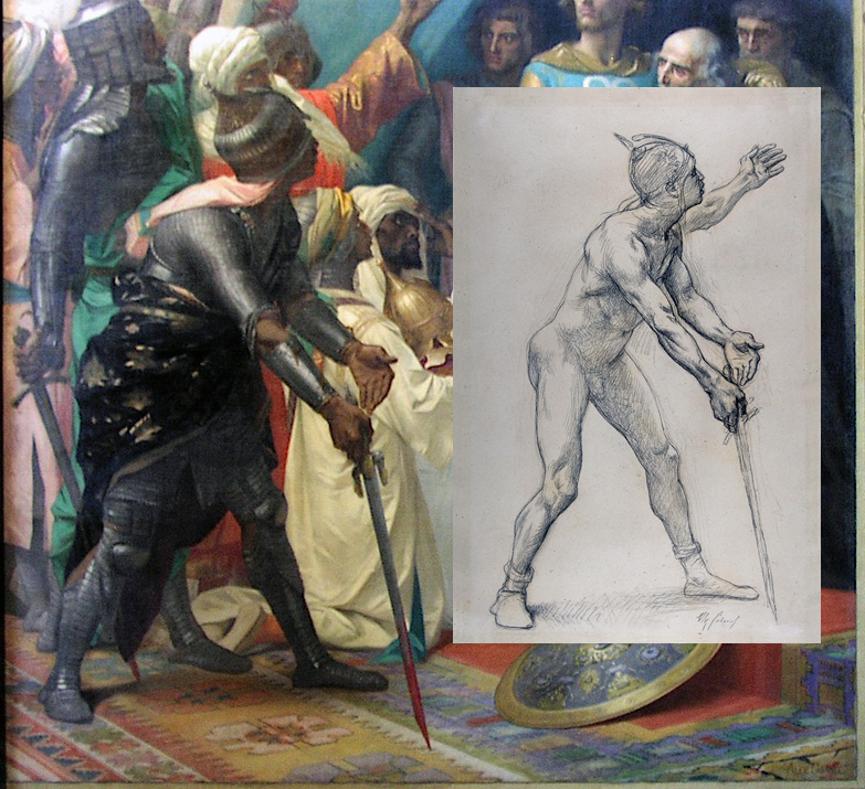
I love comparing sketches to finished work. Aside from being able to gain insights into the working procedures of various artists, the more important reason is to see their thought process in pushing the picture forward. To see what they learned from doing the sketch, and needed to correct in the final painting. This could be a repositioned arm or a major change to the pose.  An adjustment of the value composition or adding completely new elements.

A Detail of a Mural by Alexander Cabanel
 When you see a difference between the sketch and finish you should try to reconstruct the artist thoughts and reasons for the change.  Always assume he had a good reason.

Campaspe by John William Godward

Of course, unless an artist is extraordinarily lucky (or skillful) there will be changes necessary between the sketch and finish. The sketch is a tool to identify what is right and what is wrong in the pre-conception of the image that the artist holds in his minds eye.


The primary difference between these Bouguereau images (below) is the development of the darker values. The darkening behind the legs at the bottom helps the "rise" of the figures. However this darkening required Bouguereau to redesign the silhouette of the white drapery to flow behind the mans foot to make it read easier and disengage it from the background thereby adding to the feeling of floating. Additionally it creates an alignment of leg, foot and cloth edge that echos and reinforces the lines of the woman's legs pointing diagonally down to the lower corner and again emphasizes the thrust upward.

A Bouguereau Finish and sketch painting.
A sketch drawing for Herbert Draper's "Flying Fish"
Another Bouguereau sketch.

Wednesday, July 18, 2012

Imaginative color in 19th century fantasy art - Part 1


Here are a few of the images previously posted in my “Victorian Fantasy Art” album on Facebook, but with new comments:
This is a painting by Benes Knupfer who has pushed the colors in a lyrical direction.
Before color photography began limiting the imagination of artist by “dumbing down” the color range that they were used to seeing (remember that the photographic process compresses the millions of color shades of nature into a mechanically limited few thousand) fantasy artists felt free to stretch the colors in their paintings in lyrical and dramatic directions, though always taking care to maintain a naturalistic proportional relationship among the colors.

A mysterious beauty of a painting by Maximilian Pirner who has made some unexpected color choices
This made sure that even as the colors were exaggerated the image still gave the impression of being a believably real representation. When these proportional relationships between colors and values are lost the image begins to look cartoony and the main goal of good fantasy art: “To make the unreal seem real” is lost as well.

"Pharaoh's Army Engulfed By The Red Sea" by Frederick Arthur Bridgman.
Gaston Bussiere's painting of "The Rhine Maidens"

Another Bussiere painting of sirens.  He always paints with highly saturated colors.